"I love that you've brought this to attention. An extensive database of uncommon but resistant and hardy plants/foods could be developed and organized by climate. Ease of growth and processing should also be taken in to account. I will try to…"
A crash course in changing the world.
Visualizing Doom
Expanding on marginal yields, I want to put it in a visual context for everyone:
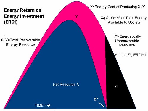
Notable things about this graph are that as time progresses, the distance between gross energy (blue) and net energy (green) increases and the ratio of gross energy (capital expense) to net energy (the marginal yield) increases. The result is not only less total energy available due to the finite nature of conventional energy sources (causing the peak shape), but also a decreasing surplus yield from those sources, making them less worthwhile to exploit. Another point worth mentioning is that peak net energy precedes peak gross energy. If gross global energy supplies are peaking, then that just puts us that much further behind the 8 ball.
Here's another one (it's a bit more colorful):
And again:
So, given that society needs energy, how is society even going to be able to maintain its energy supplies when the benefits society confers demands an increasing share itself? Society will not be able to do both. Increasing societal benefits means increasing the energy strain, so any new benefits (e.g. raising global standards of living) are largely going to consume whatever new energy is brought online.
Anyways... have a nice read.
-Iron Helix
Views: 169
-
Comment by Patricio Buenrostro-Gilhuys on April 24, 2010 at 12:30am
-
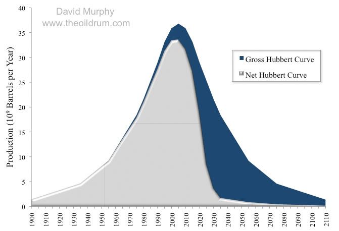
Very interesting as always Iron. . . . In the first image- is there historical data of points where civilizations reached all the curves at the same time?
In the second one- In Net Hubbert´s curve that for me is an urgent call to invest the little oil left in the oil that renewable green technologies need. Not to be wasted as we do now. On the other hand I think peak oil is a combination of 3 things: Real scarcity, artificial scarcity created by private oil companies (those guys will do anything for extra profits) and scarcity created by national oil companies that are preparing for the scarcity created by the past too. It´s like a self fulfilling prophecy.
The third image- Many systems work this way, yet no energetic system is isolated, there is always other energy systems. Problem is and this is what you may be thinking is that ALL the Earth Energetic system looks like this. You could be right, or wrong . . . honestly I don´t have the answer.
-
Comment by Iron Helix on April 24, 2010 at 5:11am
-
The first graph is an extrapolation of Energy Return on Energy Invested. The causal factor is the increased energy cost as time progresses. This is due to the natural inclination to exploit the easiest and cheapest resources first. If you want real world examples of this as applied to specific resources, I can refer you to individual oil fields, coal mines, ore mines... Microcosms are of course available, and they can be observed both historically and currently, on a natural level and a societal one. Applied globally however, this situation is largely unprecedented.
-
Comment by Gabriel Martin on April 24, 2010 at 5:55am
-
If the LDR is the problem, and assuming you applything to all energy units (as it sounds like you do) then the Law of conservation of energy would be a resolution. Am I correct then in saying then, oh sooth of Evoke, Because energy is never destroyed, a new method of refining energy can always be created, as the equivilant amount of energy is still present on our planet(save for space bound radiowaves and materials) correct?
-
-
ack! text copying.. *and assuming you apply this
-
Comment by Julio Cesar Corona Ortega on April 24, 2010 at 6:11am
-
Instead of knowledge share, I am giving you +1 sustainability. I think this is the type of concepts and pitfalls that need to be thoroughly analyzed if anybody truly wants to create any form of sustainable living. Without this kind of information, "sustainability" merely becomes a balloon waiting to pop.
-
-
You can hope for the techno fix, sure. What's at issue is not background energy, but the energy used to sustain society. If society used background microwave energy (I'm reminded of Sim City here lol), then these graphs are largely inapplicable, because they pertain to finite resources (although I guess at some distant point even microwave energy could be considered finite...). The area under the curves of these graphs represent a limited resource. If you want to apply it to every energy system on the planet, then that area under the curve only gets larger. However, I'm not arguing thermodynamics. What I'm arguing is supply and cost production. This is the paradigm society has built itself on, and it is what is required for its continuation. If new energy, in whatever form it may be, is not cost effective (particularly denominated in energy cost), then you won't be seeing it anytime soon.
-
Comment by Ken Eklund on April 24, 2010 at 6:21am
-
The problem, Gabriel, is that energy is not fungible: there's always infrastructure in place that depends upon energy in a particular form. A bale of hay is energy, but it could no longer be used for transportation once you sold your horse and bought a car. Sometimes the infrastructure can be transferred or adapted, as whale oil lamps did to kerosene or coal furnaces to oil. But we have tremendous infrastructure based upon cheap oil and nothing but oil, really, will do. Humans now burn a cubic mile of oil every year; that's a lot.
-
-
Could you both be underestimating the materials industry? Roll to roll photovoltaics are a reality, and nanoscale lithography (in its many forms) and engineering are coming into their own, perhaps your expertise is limited to a world with a 2D periodic table, while the future contains a 3D version, already demonstrated with colloidal gold as a dye and in many other novel material applications. Obviously I dont question and wouldnt even attempt to refute either of your points, as they are both solid, but limiting our concepts of energy seems... like saying that there isnt life on other planets.
(btw, Sim earth was my favorite, played it with floppy disks lol)
-
Comment by Jeremy Laird Hogg on April 26, 2010 at 7:46pm
-
An energetic way of saying we can't have everything that we want.
Comment
Latest Activity
Fourth of July on the Lake
This past weekend was the annual celebration at the lake house in Connecticut. It is amazing that the lake is still so clear and beautiful after all these years. The watershed association has done a wonderful job protecting these waters from the damaging effects of development.The wood grill was finally ready to cook on, so we didn't miss the propane tank fueled grill anymore. The food actually tasted fresher than in the past and was easy to keep fueled.Dad was very proud of the solar hybrid…See More
Stinging Nettle
In this blog post I will focus on a plant that is abundant in our nature, and which is immensely nutritious. It's of course the Stinging Nettle. Let's start with the chemical constituents of this plant:37 % Non-Nitrogen-Extracts19 - 29 % Ash9 - 21 % Fiber4 % Fat22 % ProteinOnce the leaves are drid, their protein content can reach an astounding 40 %, which is much higher than beef, which even under the best of circ**stances can never exceed 31 % protein. In addition the Stinging Nettle consists…See More
The meal
It is 7'oclock, I was late home from work due to an assignment that i wanted to get ahead on. By the time I get home I am feeling extremley tired and I cannot be bothered to make a proper meal. I walk to the fridge and open it to see what there is for me to eat. All of the out of date foodstuffs have been automaticaly thrown away by the fridge, they will be recycled tomorrow as animal feed or something. I see i have organic local eggs and some local cheese. Foods are vacc** sealded for easy…See More
Future
FutureToday is 2020/1/1. It is just like yesterday. The war is still continuing. It has started since 2010. In 2010, that year was a horrible year. Almost every energy ran out. Every country’s governments were crushed down at the same time. There were riots everywhere. All of the big company’s bosses were killed xdeadx in the riots. Troops fought each other everywhere. Food was bought up xawayx at once. There were no more food supplies in any shops. The economy was all crushed down. All the…See More
public servants
The exchange works directly for state and public workers and servants. It gives them credit in exchange for the amount of public work they contribute to the community. The more constructive they are based off a base rate the more credit they recieve.


© 2024 Created by Alchemy.
Powered by
![]()
You need to be a member of Urgent Evoke to add comments!
Join Urgent Evoke